As the lead web designer for Chautauqua Journal, an online literary magazine, I was tasked with redesigning their logo, choosing accent colors, and creating a website.

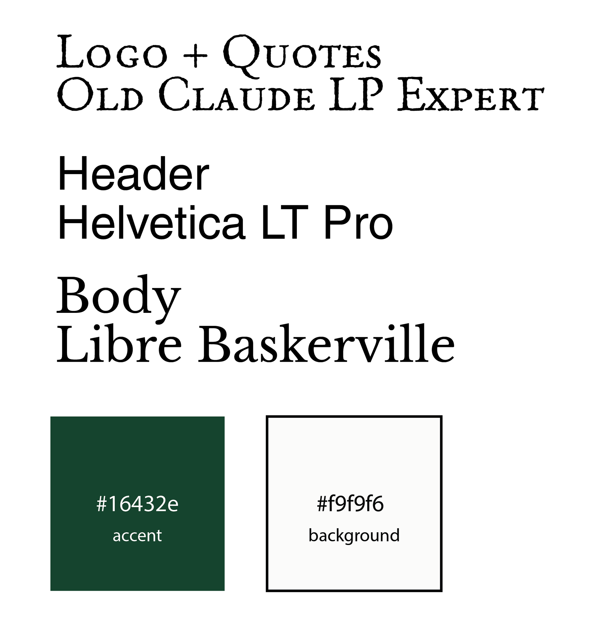
The logo needed to be distinct from many online literary journals. That meant, no books or pens, nothing expected. It had to feel unique to Chautauqua.
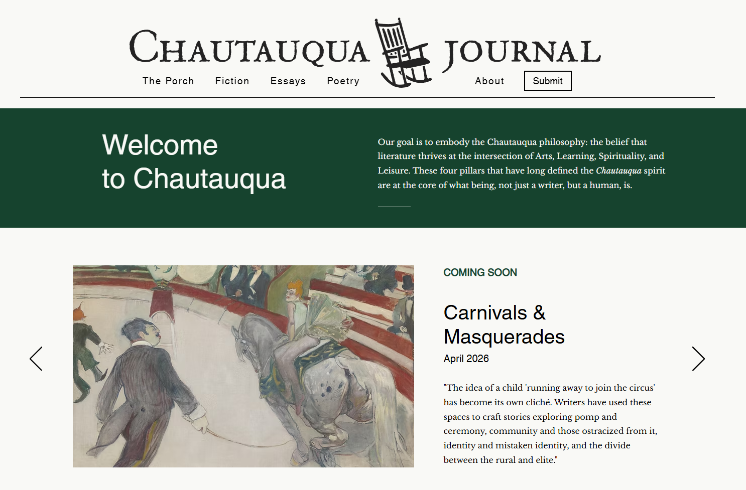
The rocking chair became that symbol. It could be found in both Chautauqua, New York—where there journal was originally founded—and in Wilmington, North Carolina, where it now resides. Porch culture stretches across the United States, and we were drawn to what it represented: a space where neighbors gather to share stories and connect.

While it was important to revamp the overall design of the magazine, we also wanted to retain the traditional charm of a publication that has existed for over 20 years.
We settled on a blend of sans-serif fonts for the website navigation, and serif fonts for the logo and body text of the published works.
Alongside these typographical choices, it was equally important that the accent color, used across the website and social media platforms, reflected this refreshed vision. Green struck the right balance, feeling both academic and sophisticated while still remaining modern.
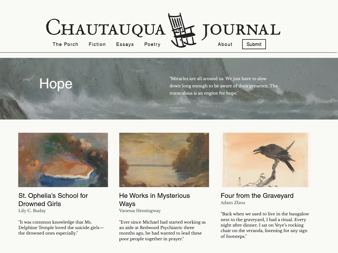
The website's design is clean and easily navigable. We use open-source artworks that reflect the aesthetic of each published piece to entice our readers while adding a visually engaging and cohesive element.